AI-powered heatmaps are changing how we design websites. They provide more data to show you where people click, scroll, and look on your pages. This helps make sites easier to use and gets more people to buy or sign up.
Here, we show you how using AI-powered heatmaps can optimize your website design for better and more successful customer experience.
What are AI-powered heatmaps?
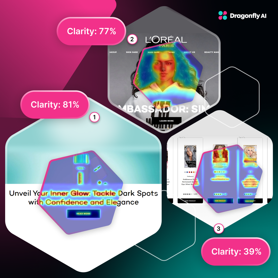
Heatmaps use colors to show where people interact most on a webpage. Red areas are "hot" with lots of activity. Blue areas are "cold" with less action.
They show aspects like:
- Where their eyes look on the page
AI makes heatmaps even smarter. It spots patterns in how people use your site. It can even guess how changes might affect behavior, meaning you can improve your site faster than non-AI heatmaps.
It’s all about the user experience
Good user experience (UX) is key to keeping people on your site and getting them to do what you want, like buying something or signing up. A well-designed site keeps visitors engaged, stops them bouncing, and turns more of them into customers.
Why AI tools for UX design matter
AI heatmaps help designers make better choices based on real data. They show what analytics miss and can predict how changes might work. This means designers can make smarter decisions to improve how sites perform.
-1.png?width=1280&height=700&name=Blog%20image%204%20(6)-1.png)
They're becoming a must-have tool for modern website designers, showing you exactly how people use your site, not just how you think they might. This helps you make changes that really work, not just ones that look good. Plus, they keep learning and improving over time, just like your website should.
How AI-powered heatmaps improve UX design
AI heatmaps act as highly intelligent trackers for your website, providing detailed insights into user behavior and interactions. They show you exactly how people use your site.
These tools provide more insight into user behavior insights to reveal where visitors look first, what grabs their attention, and how they move around your pages. It's akin to gaining deep, real-time insights into your users' thought processes and behaviors.
AI heatmaps spot trouble areas and can flag parts of your site that cause headaches for visitors. Maybe it's a confusing form, a button that's hard to find, or content that people ignore. By finding these issues, you can fix them and make your whole site work better.
AI heatmaps don't just show problems—they suggest fixes and make changes that work. They might tell you to:
- Move your "Buy Now" button where more people will see it
- Rearrange your content so the important stuff comes first
- Get rid of things that distract visitors from what you want them to do
The best part? These suggestions are based on how real people use your site, not just guesses. So, they're more likely to actually help.
Benefits of using AI tools for UX design
AI tools for UX design help you understand visitors better, make data-driven decisions, and improve your site. Here's how they benefit designers.
- Understand visitors better and see exactly how people use your site.
- Make decisions based on facts using real data instead of guesses.
- As visitor habits change, keep your site up to date and make continuous improvements.
- Fix problem areas to boost your results and get more sales or sign-ups:
- Save time and quickly spot issues that might take ages to find by hand.
- Sites using AI insights often work better for visitors, giving you a head start against competitors that aren’t using it.
AI heatmaps also optimize layout and design to show you where to put important information on your pages. They help make sure visitors see the things you really want them to notice.
Even better, these tools are always getting better. AI tools keep learning as more people use your site, meaning your design can keep improving over time, adapting to how visitors' habits change.
Best practices for using AI heatmaps in UX design
So, how do you get the most out of AI heatmaps? From using data to knowing where you want to improve, here’s how to implement AI heatmaps in your US design.
- Use data, not just hunches. Don't just go with what you think looks good. Let the AI insights guide your choices.
- Fit AI into your workflow. Make using AI heatmaps a regular part of how you design and test your site.
- Test, then test again. Use AI heatmaps with A/B testing. Try different designs and see which one works best.
- Know what you want to improve. Maybe you want more newsletter sign-ups or fewer people leaving your checkout.
- Check different pages. Look at your homepage, but also product pages, blog posts, and landing pages.
- Look at different groups. See how new visitors act compared to returning ones.
- Use other tools too: Combine heatmaps with regular analytics and user testing.
- Make small changes. Try little tweaks based on what you learn and see what works.
- Think about the whole journey. Don't just fix one page. Look how changes affect the entire site experience.
- Share what you learn. Show heatmaps to your design, marketing and tech teams.
Remember AI heatmaps are tools to enhance your design process, not replace it. Use them to inform your decisions, but always consider the broader context of your brand, audience, and business goals.
Real examples of AI heatmaps in action
It’s all well and good talking about what AI heatmaps can do, but what do they look like when put into action?
Homepage redesign
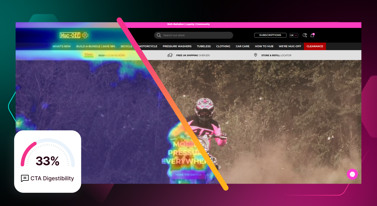
Muc-Off is a company that makes cleaning products and uses heatmaps to make their homepage better. They looked at how users scrolled and clicked, found where people were leaving the site, and moved important stuff around. This led to an impressive 106% increase in purchases, showing how small changes based on data can make a big difference.

Amazon's product page optimization
Amazon used heatmaps to improve their product pages. They found out people often scrolled past important product info to get to customer reviews. So Amazon changed its pages, putting key details higher up and making customer reviews easier to see. This led to more people using the site, more sales, and happier customers.
The North Face's checkout fix
Heatmaps showed The North Face's website team a problem with their checkout. A rewards program ad was catching people's eyes more than the 'buy' button. Once they spotted this, they tweaked things. It's a good example of how heatmaps can uncover surprising things that stop people from buying.
Where to next with AI-powered UX design?
AI is only going to get better. The versions we see today will look different in the future as the technology improvements and offers even more value. As AI gets cleverer, we might see:
Layouts that design themselves
AI could suggest page layouts based on how it thinks people will use them. At the very least, this will provide a starting point for designers so they’re not faced with blank pages.
Pages that change for each visitor
Websites might tweak their design for individual users based on how they behave. A dynamic page offers even more personalization to users and increases the chances of conversions.
Designs that understand feelings
AI might work out how people feel by how they move their mouse or through their webcam. It’s a whole new layer of interaction, one that provides even deeper insights into customers.
Voice and gesture friendly sites
As more people use voice commands or hand gestures, AI tools might help make sites work better with these voice assistants.
Seamless experiences across devices
AI could help make sure your site works smoothly whether someone's on a phone, tablet or computer. This should be the case already, but AI can eliminate errors and get you to the end point faster.
Working with other AI tools
Heatmap information might team up with chatbots and personalized recommendations to make sites even better. It could do this by feeding real-time user behavior data into these systems.
Smarter analysis
AI tools might get even better at spotting patterns in how people use websites. This can help predict trends and understand user habits on an even deeper level.
The power of AI heatmaps
AI heatmaps are shaking up website design. They show you exactly where people click, scroll, and look - helping you build sites that really work. As AI gets smarter, so will our websites. Clever designers are already using this tech to create pages visitors love and businesses need. AI heatmaps lead to websites that are easy to use, keep people interested, and boost your bottom line.

