The level of online competition has heated up substantially with many more brands investing in D2C than ever before. Creative assets are constantly fighting for consumer attention which is why placement, choice of messaging, and visual design are so critical.
For global brands, delivering effective content at scale across multiple markets can create challenges. Whether creative production is handled in-house or through agency partners, setting effective design benchmarks helps brands to improve standardization, quality, and ultimately performance (ROI).
Key principles remain true in understanding how our brains process information and how we prioritize where to direct our limited attention.
Hierarchy in Graphic Design
The creative production lifecycle can be incredibly lengthy when traditional pre-testing plays a role. When you implement message hierarchy in graphic design it gives you the insight to effectively design your asset based on predicted audience attention.
Many of you are familiar with this famous graphic:

Original

Dragonfly AI
This is a wonderfully simple example of the power of hierarchy design.
Whether designing the next generation of product packaging or re-working the checkout flow on your e-commerce store, you’re likely to have several design goals surrounding which elements you want your audience to see first. This takes into account what you want your audience to remember later; and what action you want them to take next.
Creating a clear visual hierarchy (which maps to these design goals) helps your message land so that your audience sees what you want them to see.
When you want to learn more about how to accurately measure the effectiveness of design decisions, you need to consider visual hierarchy. This assists us in measuring whether what you create aligns with our goals for our audience’s experience.
The Science Behind Visual Hierarchy
Our brains consume vast amounts of visual information but there is a limit to how much you can process and pay attention to at any given time. Because of this limitation, humans have evolved to prioritize visual information based on several visual cues.
- Color
- Contrast
- Texture
- Orientation
- Scale
- Movement
These visual cues help people quickly evaluate the world around them and identify what may deserve their attention before their conscious mind kicks in. This is called the pre-cognitive stage of viewing.
When humans view the world around them without a specific prior motivation, these visual characteristics govern where they look and what grabs their attention (this is called free viewing).
Viewing the world around them with a specific prior motivation (e.g., searching for the same breakfast cereal they purchased last week) their prior motivation dictates where they may begin their search, but the same visual cues still govern what catches their attention within their field of view (this is called intrinsically motivated viewing).
The Dragonfly AI algorithm mirrors the way your brains process visual information allowing your users to objectively determine the visual hierarchy for any given asset and identify whether that hierarchy is likely to be helping or hindering overall performance.
The algorithm wasn’t trained using specific datasets (e.g. fixation data from eye-tracking tests). Instead, has been designed to simulate the way human brains process visual information from a biological standpoint. For this reason, the algorithm does not have a training bias towards a specific touchpoint or category. It uses the same natural processing capability the human brain employs when it is ingesting and prioritizing what we see in the world around us.
Message Hierarchy for Advertising & Promotion
The average consumer encounters between 6,000 and 10,000 ads every single day. The MMA also recently published its 1-second strategy, recognizing that we have less than a second to catch the attention of today’s consumers. Ensuring your ad stands out within its context is key to maximizing overall reach, however, it’s the visual hierarchy within the ad that dictates whether viewers see what you want them to see and takes away the key message.
Image 1: Billboard Advert
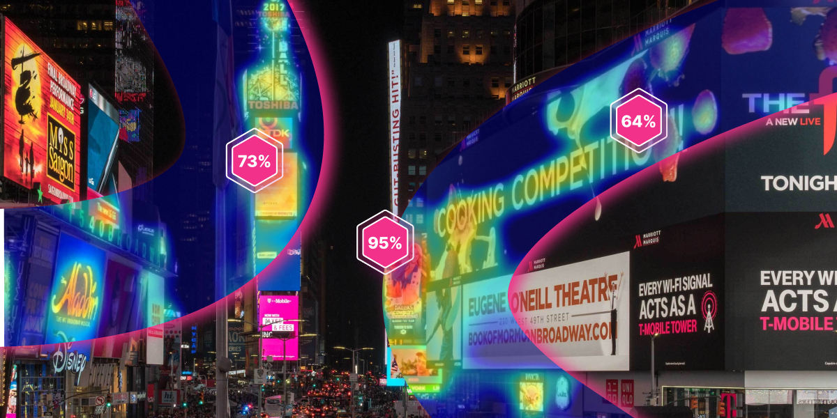
This advertising billboard run through our hotspot report shows you the number of elements that are drawing people’s attention and in what order.
Shopper Marketing
Visual merchandising plays a key role in helping products to stand out in a physical store environment. Visual merchandising must effectively convey the key messaging to hold shoppers’ attention. A clear visual hierarchy helps you cut through the noise and build awareness with shoppers.
Store environments can be chaotic with numerous promotional assets competing for the attention of shoppers as they move throughout the store. End-of-Aisle and Point-of-Sale promotions play a key in driving impulse and incremental purchases. A clear hierarchy design ensures that when shoppers do see your promotion, your message is heard.
Lastly, brands are always looking for an edge to maximize their share of attention in-store. Packaging must win the attention of passing shoppers and then effectively communicate key information to hold their interest and have a chance of convincing them to make a purchase. At low price points, many purchases are sub-conscious, so design and message hierarchy play a key role in who comes out on top.
Image 2: Product packaging
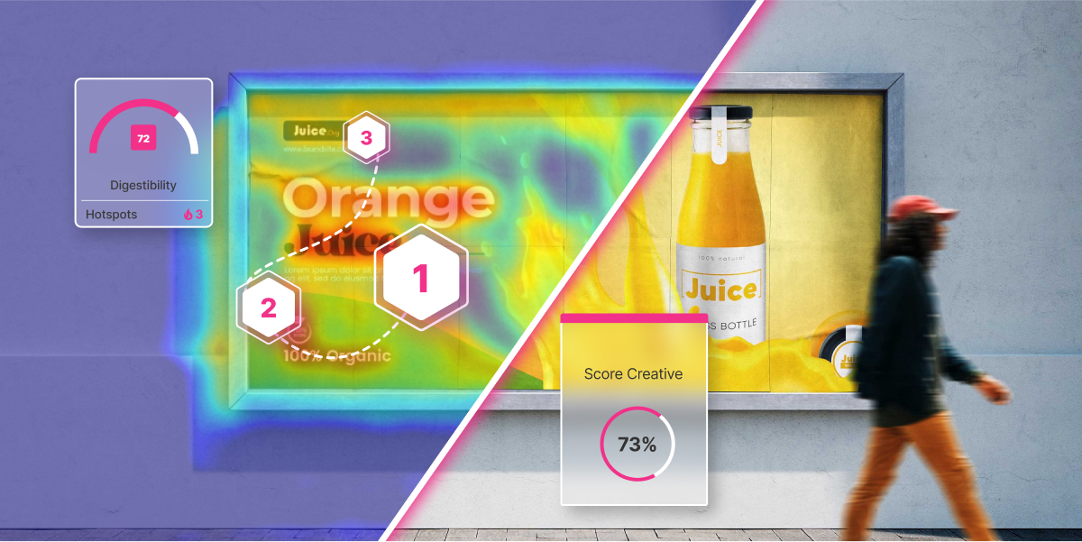
This product packaging run through our hotspot report shows you the number of elements that are drawing people’s attention and in what order.
eCommerce & Landing Pages
Consumers have increasingly shorter attention spans. Landing pages need to deliver a strong value proposition before the user loses interest and moves on. Having a clear visual hierarchy will help you make the most of every conversion opportunity by ensuring your message lands and your visitors know how to take the next step if your message hits the mark. What’s more, reducing friction in key customer journeys online is critical to maximizing conversion. Helping customers to quickly identify trust signals and understand how to proceed to the next stage will reduce cart abandonment and ultimately increase sales. A clear visual hierarchy helps makes the customer experience seamless.
Another thing that visual hierarchy aids are self-service online. Great customer support is high on the priority list for today’s consumers. Self-service support options can help customers find information faster and reduce the load on support agents. For self-service to be adopted, customers need to be able to find information fast.
Image 3: eCommerce website
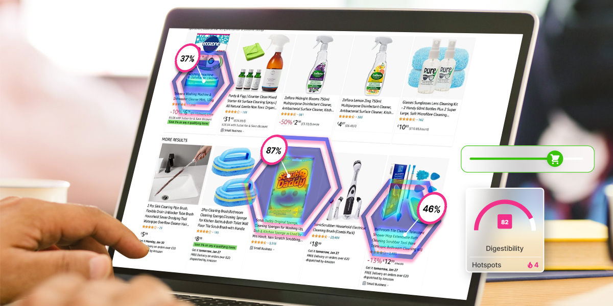
This eCommerce landing page that has been run through our hotspot report shows you the number of elements that are drawing people’s attention and in what order.
Improve Customer Experience with Effective Hierarchy Design
Visual hierarchy is fundamental to our ability to productively communicate across all channels.
The premise is simple, but good creative hinges on our ability to identify the right design objectives from the outset. Whether that’s building brand awareness, evoking an emotional response, or creating a compelling call to action.
When you understand this, you can design content and experiences that effectively deliver on these objectives and improve the customer experience.
Creatively pre-test at scale with Dragonfly AI, spend 15 minutes with us to find out how.

.png?width=596&height=562&name=2x%20(1).png)


