If you’re thinking: “data visualization, what the heck is that?” you aren’t the only one. But its definition is simpler than it sounds. It’s all about turning numbers and data into pictures, graphs, or other visuals that are much easier to understand. It's incredibly useful, especially when you've got a lot of complicated info you need to make sense of quickly.
Over the years, this technology has gone through many growing pains, and one example of how it has morphed is roadmaps—Remember those old paper maps?
Today, we’ve got interactive maps at our fingertips, where you can get directions, zoom in, search for places, and get additional info by clicking on locations. This change from paper to digital shows how human beings have always tried to make data easier to use and understand.
The Historical Context of Data Visualization
Imagine stepping back in time when the fanciest data visualization you could find was a chalk-drawn chart on a blackboard. It was all about making numbers look less intimidating and more understandable. When the first pie chart was created in the 1801—it was a total game-changer. Suddenly, people could see proportions visually without crunching numbers in their heads.
Then came the computer age when data visualization took off like a rocket. We went from paper-bound charts to dynamic, interactive visuals you could explore with a simple click or swipe.
This is a testament to our ongoing quest to unlock the secrets hidden in data, making visualization a powerful tool to be used in everything from business decisions to understanding global trends.
Current Trends in Data Visualization
Let's take a look at some of the latest trends shaping data visualization today, showcasing how we're turning complex data into engaging, user-friendly experiences.
Interactive Visualizations
Picture this: You're not just looking at a static graph; you're clicking, dragging, and watching the data change in real time. Interactive tools have flipped the script, letting anyone dive deep into the numbers, uncover patterns, or see how different scenarios play out in real-time.
-1.png?width=1280&height=700&name=Blog%20image%201%20(17)-1.png)
Data Art and Aesthetics
Gone are the days of dull, dry charts. Now, data visualization is an art form. Designers are merging data with visual storytelling, creating stunning pieces that draw you in. This blend of art and information makes complex data not only more digestible but also a joy to explore.
Mobile Optimization
In a world glued to smartphones, data visualizations have gone mobile. Creating visuals that are just as clear and compelling on a tiny screen as they are on a desktop is key. This means designing with simplicity and clarity in mind, ensuring that the audience can understand the data with just a glance at their phones.
Automation in Visualization
Thanks to AI and machine learning, we're now automating the art of making complex visualizations. This tech crushes through data, spotting trends and patterns we humans tend to miss, and then turning those insights into visuals with little effort.
Integration with Big Data
Tackling the big data beast means diving into an ocean of information and coming out with clear, understandable visuals. It's a tough gig, but thankfully, the tech to make sense of this data flood is getting sharper every day.
We're talking about the innovative tricks and tools that help sift through the chaos, spotlighting the nuggets of wisdom hidden in mountains of data.
Whether it's making interactive maps that let you zoom into the details or using AI to predict the next big trend, visualization, and big data help turn that data deluge into something you can wrap your head around.
Spotlight on Good Data Visualization
Alright, let's break it down into what makes data visualization so easy to understand. It boils down to a few key ingredients: clarity, accuracy, efficiency, and aesthetics.
Here’s how to nail it:
- Keep It Clear and Simple: The best data visuals are the ones that turn “Wait, what?” into “Oh, I see!” Pick the type of chart or graph that gets your point across without making your head spin. The goal? Make anyone, even a kindergartner, get the gist of what you're showing without needing a decoder ring.
- Stick to the Truth: No funny business with the numbers. Your visuals need to tell it like it is, showing the real deal of what’s going on. That means no stretching the truth or squishing the facts to make things look better or worse than they are.
- Get to the Point Fast: Great data visuals don’t beat around the bush. They hit you with the good stuff right away, showing you exactly what you need to know without dragging you through a maze of info.
- Make It Eye-Candy: Yes, looks do matter here! Creating visuals that are easy on the eyes and kinda fun to look at means people are more likely to pay attention and remember what they saw. Use colors, shapes, and layouts that not only look sharp but help your data story shine.
- Tailor It for Your Audience: Think about who’s going to be looking at your visuals. Whether it’s for marketing efforts, your team at work, or just for fun, make sure your visuals speak their language. Customize your visuals so they hit home with whoever's looking at them.
- Make It Playable: Who said data can’t be fun? Adding interactive bits to your charts or graphs turns them into a playground for the curious. It’s like making data exploration a mini adventure, letting everyone dive in and see what nuggets of info they can find.
The Role of Google Trend Visualizer and Similar Tools
Ever tried to figure out what the world is thinking or how certain topics trend over time? That's where Google Trend Visualizer comes into play. It’s like the magnifying glass of the internet, zooming in on what people search for, showing us the pulse of global interests.
Making Data Trends Accessible
Tools like Google Trend Visualizer break down the barriers between complex data sets and the general public. It helps transform search data into visually appealing graphs and charts, making it easier for everyone to see what's hot and what's not. This tool helps level the playing field of data, so that not only data scientists, but also marketers, journalists, and curious laypersons can peek into the mind of the online world.
Google Trend Visualizer in Action
- Market Analysis: Imagine launching a new product and wanting to gauge interest in similar items over the past year. Google Trend Visualizer can show you when searches are at their peak, hinting at the best time to launch a marketing blitz.
- Forecasting: By examining past trends, businesses can predict future demand. If searches for "sustainable fashion" spike every March, a brand might gear up with eco-friendly lines in time for the surge.
- Storytelling: Journalists and bloggers use these tools to back their stories with hard data, turning abstract numbers into engaging narratives. For example, tracking the rise in searches for "home workouts" can tell a compelling story about global shifts toward fitness culture.
-1.png?width=1280&height=700&name=Blog%20image%202%20(14)-1.png)
What’s Next? Predictions for the Future of Data Visualization
Data visualization is already pretty cool, but it’s about to get even cooler. As we peek into the crystal ball of tech trends, we can see some pretty amazing advancements on the horizon.
Augmented Reality and Virtual Reality: Immersive Exploration
Imagine stepping into a graph or walking through a dataset. These technologies are set to turn our screens into windows to another realm where data isn’t just seen but experienced. Picture exploring a virtual representation of climate change data, where you can watch glaciers melt or forests shrink over time, making abstract numbers painfully tangible.
Greater Personalization: Customized Data Stories
In the future, data visualizations might know you better than you know yourself as they start to adapt to your preferences, learning what details you care about and presenting them in the way you find most intuitive.
Advancements in Real-time Data Visualization: Instant Clarity
Real-time data visualization is about to get a turbo boost. We're talking about watching election results shift the moment a vote is counted or monitoring stock prices with visuals that morph by the second. This instant clarity will transform decision-making processes, from boardrooms to living rooms, making it possible to react to the world in a blink.
Increased Accessibility: Data for Everyone
Data visualization will become more inclusive, so that everyone, regardless of ability, can dive into data exploration. This means developing visualizations that aren’t just stunning but fully accessible to people with disabilities, incorporating features like screen reader compatibility, high-contrast modes, and alternative text descriptions for every element.
Instant Predictive Insights: Smarter, Faster Creative Decisions
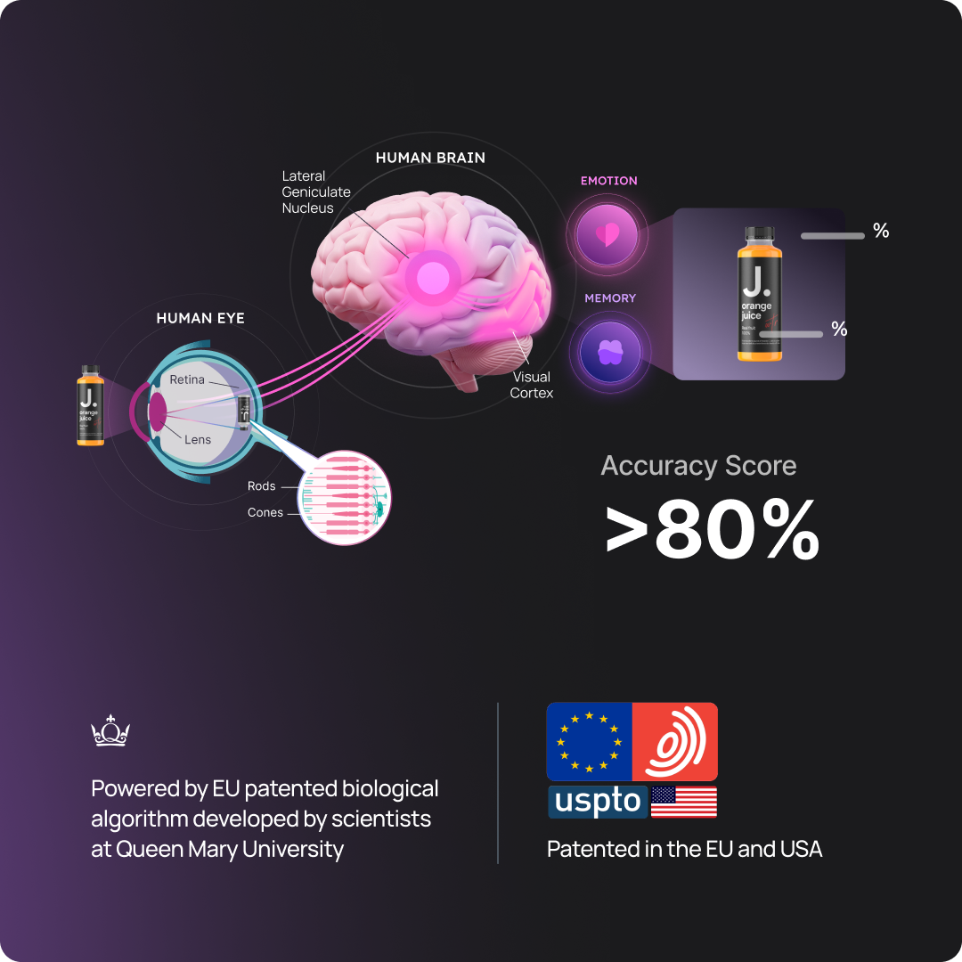
The future of data visualization also includes a sharper focus on predictive insights. Imagine having a tool that not only shows what’s currently happening but also predicts what will grab the audience's attention tomorrow. This means better-quality visuals reaching your audience at the right moment, maximizing impact.
Wrapping It Up
Data visualization has come a long way from simple pie charts and line graphs. Understanding this evolution is key if you want to keep up with the fast-paced changes in technology and the ever-evolving need for data analysis. It's not about simply making pretty pictures; it's about turning complex data into insights that can drive decisions, spark conversations, and inspire action.
The best way to predict the future is to create it. Let's shape the future of data visualization together, making it more immersive, personalized, and insightful than ever before.

.png?width=596&height=562&name=2x%20(1).png)
