Customer behavior changes frequently. Trends are quickly forgotten, replaced by the latest fad at the click of a finger. It leaves brands constantly playing catch-up, especially in the world of consumer-packaged goods (CPG), where shopper preferences are always evolving and technology continues to shift the goalposts.
Staying on top requires awareness, and this all starts with your website. A fluid website helps meet evolving demands while setting the foundation for long-term success. That's why it's so important to future-proof your website in the face of changing consumer behavior.
7 Steps to Future-Proof Your CPG Website
These seven steps are designed to keep your website relevant in a sea of changes and an industry that’s always evolving.
Step 1: Website Best Practices
The future of your CPG brand starts with a website that doesn’t just tick boxes but explodes out of them. The look and feel of your website are important, but so too is the usability—a responsive design is required for an excellent customer experience.
Craft a digital home for your company, one that’s fluid and engaging, whether it’s on desktop or mobile. That last point is particularly important because, let’s face it, your consumers are scrolling on the go, with more than 50% of people using the web on a smart device.
Speed is also the name of the game. In a world where a second delay means a customer is lost, your website needs to be lightning-fast. Picture your typical shopper hunting for the perfect snack or essential household item. They don't have the time to wait for a sluggish, unresponsive page.
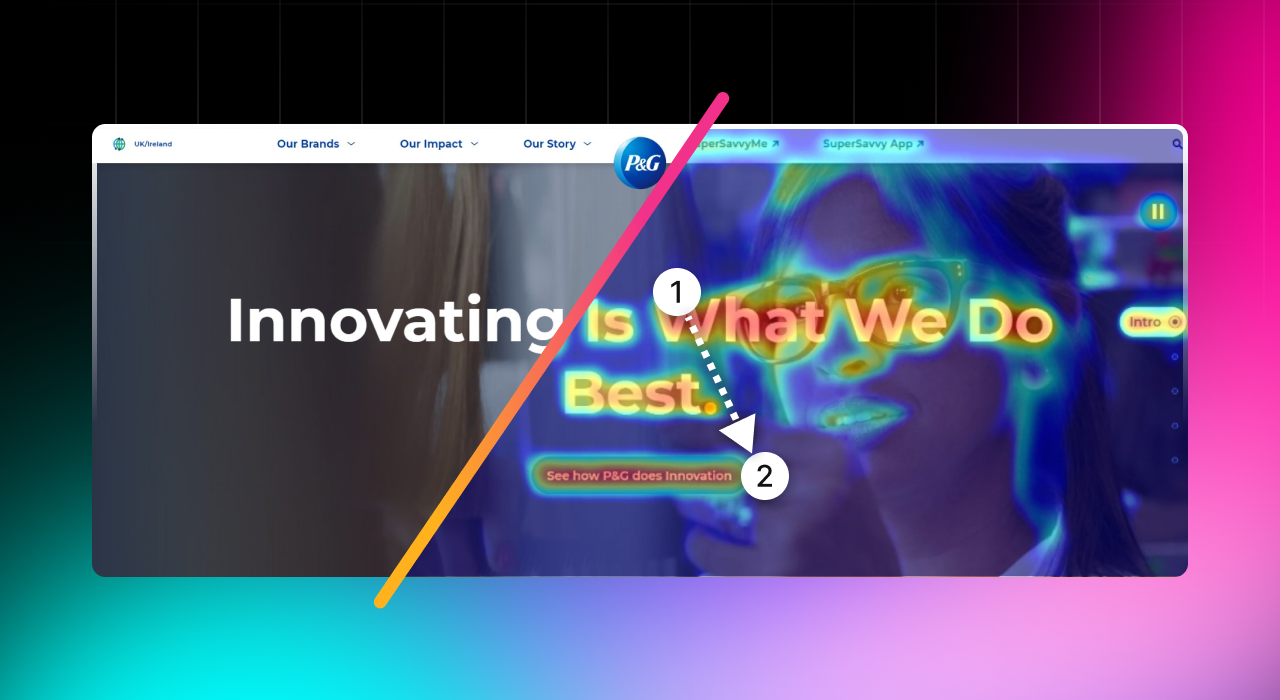
Look at Procter & Gamble's site. It’s a fine example of website best practices with its slick, speedy, and responsive design. The goal is to exceed customer expectations and set the bar high for what a CPG website looks and feels like.
Step 2: Website Navigation Best Practices
Now you’ve got the fundamentals of a website, it’s time to master intuitive navigation. This is where art meets science, creating a user journey that feels like second nature for browsers visiting your site. People landing on your website should be able to find what they need with minimal effort.
Make your content easily discoverable with clear categories, logical flow, and a search function that's more like a helpful guide than a basic tool. This approach will help transform browsing from a chore to a pleasure for customers.
For a navigation facelift, consider breadcrumbs for easy backtracking, dropdown menus for sleek organization, and well-placed CTAs guiding users toward their next step. Look at other successful CPG websites, which turn navigation into a seamless journey while boosting user engagement and satisfaction.
Step 3: Web Optimization Tools
Leveraging web optimization tools will get your CPG website moving in the right direction. These tools are often the unsung heroes of the digital world, working behind the scenes to turbocharge your website's performance. Think of them like a pit crew for your website, constantly tuning and tweaking to ensure peak performance.
SEO platforms such as Semrush help you climb the search engine ranks and appear in results across the likes of Google and Bing. Don’t forget tools like Hotjar, either. It provides heatmaps and user journey insights, while something like PageSpeed Insights helps with lightning-fast loading times.
To harness these tools effectively, start by identifying your key performance indicators. Use analytics to understand your audience, apply SEO tools for better visibility, and use user experience tools to refine the journey. This should all form part of a strategy that uses each tool’s strengths to build a website that’s functional and formidable.
Step 4: Website Analytics Tools
Optimization tools aren't the only help available. Once you're finished configuring your CPG website for SEO, speed, etc., try out website analytics tools to gain a better understanding of customer behavior.
Google Analytics is good for getting tons of data about visitor behavior on your website and which pages they interact with. There are also platforms available that tell you about customer insights through visual and audio data, such as heat maps and recordings.
Making the most of these tools allows you to go beyond surface-level data. Dig into the analytics to uncover patterns and trends and use these insights to tailor your content, streamline your user journey, and tweak your site to align with user preferences. Collecting data allows you to create a strategic approach backed up by the numbers.
Step 5: Web Design Mistakes to Avoid
Creating a watertight CPG website that adapts to changing consumer behavior is as much about avoiding mistakes as it is about doing the right things. There are common web design pitfalls that can set you a step or two back, and the goal is to avoid these entirely.
Having a cluttered layout, for example, can drastically hinder the user experience and turn a potential buyer's journey into a frustrating dead end. A mangled canvas of information that overwhelms rather than guides will see visitors trying to find a needle in a haystack—and being frustrated by it.
Equally detrimental are poor color choices, which can strain the eyes or fail to convey your brand's message. Imagine using dull, lifeless colors for a brand that prides itself on vibrancy and energy. Avoid these traps by choosing simplicity and clarity in your design. Think of Apple's clean, minimalist layout as a classic example.
.png?width=1280&height=700&name=Blog%20image%204%20(3).png)
Seals.com (American Casting) had a site filled with technical and design flaws. It wasn't mobile-friendly, and it lacked a responsive design. On top of that, it was a clunky mix of over 1,000 static HTML pages.
However, it transformed a cluttered, unranked site into a streamlined, SEO-optimized platform. The overhaul included a revamped URL structure, category-based pillar pages, and breadcrumbs for improved navigation and SEO. The result? A 25% traffic increase in three months and top search rankings, maintaining a number one spot for terms like "Plastic Strap Seals."
Step 6: Navigation Best Practices
User navigation is the pulse of your CPG site. Look at it as crafting an invisible thread that weaves through the web pages, subtly guiding users to their desired destinations. The goal is to engineer an intuitive flow that feels second nature to web browsers.
Let's take a leaf out of Amazon's book. Its setup is a masterclass in simplicity, marrying a crystal-clear menu with a search bar that's almost telepathic in its understanding of user needs. It's an effortless interaction between the user and the website, with every click leading to a discovery.
Weave breadcrumb trails, dropdowns, and a hierarchy so natural it's instinctive. This is what transforms a website from a digital space to an experience where navigation is so seamless it's almost invisible.
.png?width=1280&height=700&name=Blog%20image%205%20(2).png)
Step 7: Optimizing a Website for Changing Consumer Behavior
Today's market is a kaleidoscope of changing preferences and expectations, and that demands a website that needs to be anticipatory as much as it is responsive.
Adapting to these shifts means embracing the art of A/B testing. Have a continuous conversation with your audience, tweaking and refining your website based on real-time feedback. This methodical approach helps identify what resonates most so your site stays aligned with evolving consumer needs.
Personalization is another key strategy. Create a bespoke experience for every visitor, making them feel seen and understood. Utilize data analytics to tailor content, offers, and recommendations that transform your website into a personal shopping assistant.
Content optimization is the final piece of this puzzle. Regularly update your content to reflect current trends so it stays fresh, relevant, and engaging. Combining these strategies means your website becomes a living entity, continually evolving alongside your consumer base and keeping your brand at the forefront of the CPG industry.
Predicting attention on the content on your website will help drive optimizations in the right ways. We recently had a client achieve a 40% uplift on their website due to improving the placement of the call-to-action button as dictated by attention metrics.
Future-Proof your CPG Website Effectively
Find the true potential of your CPG website with these seven dynamic steps. From understanding best practices to creating a site with seamless navigation that's optimized for consumer behavior, you can meet changing consumer needs head-on. Perhaps you'll even be the CPG brand setting trends for others to follow.

.png?width=596&height=562&name=2x%20(1).png)


