.png?width=596&height=562&name=2x%20(1).png)
Did you know that there's a scientific formula involved with the colors we notice first?
It is crucial that we understand which colors grab the most attention in commercial environments because attention is so limited. Knowing which colors effectively grab attention gives you the insight you need to compete against other brands.
Why Do Colors Grab Attention?
Colors are integral to visual communication and strongly impact our emotions and perceptions. Different colors trigger a wide variety of emotions and feelings–this is why companies and designers use them carefully in their branding and marketing efforts.
The right colors can attract attention, create moods, and even influence our buying decisions. Emotionally, they can make us feel happiness, sadness, excitement, and calmness, to name a few. But why do they evoke such responses from us?
Essentially, it comes down to how our brains are wired. We're naturally drawn to bright, vivid colors that stand out from our surroundings. Our brains recognize and respond to these eye-catching colors and make us take notice.
Different colors can bring up emotions, memories, and even cultural associations. Brands and designers use these connections, carefully selecting colors that will best convey their message and attract the attention of their target audience.
Reactions to colors is just one way we can measure the impact of emotions in advertising.
What Color Attracts the Human Eye First?
If you've ever tried watching TV in black and white, you'll know the difference a splash of color makes. And when it comes to the color which catches our attention the most, you might be surprised to find that it's not red, blue, or even green.
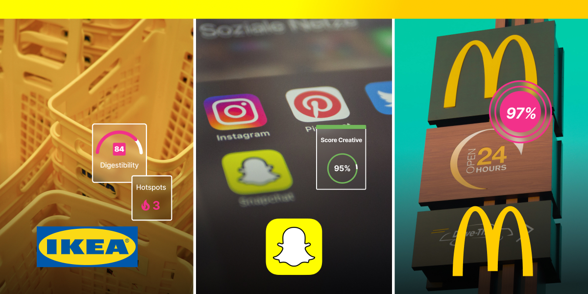
In fact, it's yellow. It attracts the eye easily and is often associated with happiness, positivity, and optimism. For those reasons, yellow is often a popular choice for many brands wanting to convey a sense of joy and enthusiasm (hello, Ikea, and Mcdonald's).
The brightness of yellow also makes it highly noticeable, which is why you'll often see yellow text against a dark background. The color helps draw attention to specific objects or areas, making it an effective tool for highlighting important information or designs. It's not uncommon to see a yellow sign making someone aware of a hazard, for example.
Why Do Different Colors Attract the Eyes Differently?
If yellow is the color that attracts our eye first, why use anything else? Other than the fact that a world of yellow would be overbearing, different colors can attract the eyes in unique ways. This is why companies and designers use colors so carefully in their branding and marketing efforts.
Understanding the psychology of color and how different hues affect us is key to creating eye-catching designs that effectively convey the intended message. And it's not just relevant for brands–everything, from road signals to instructions, uses colors to make us aware.
One reason why different colors attract the eyes differently is due to their cultural and emotional associations. For instance, green is often associated with growth, health, and nature, while purple relates to luxury and sophistication
Other factors are the hue, saturation, and brightness of the color. Bright, vivid colors tend to grab our attention more quickly than muted, pastel hues because our brains are immediately drawn to bright, bold colors that stand out against their surroundings.
Additionally, colors with high saturation, such as hot pink or electric blue, can be eye-catching because they are so intense and vibrant. By considering these factors, designers can create assets that effectively draw attention to the intended objects or areas.
Colors that Grab Attention
When it comes to attracting people's eyes, yellow isn't the only color in town, and some are proven to be more effective than others. Red, for example, is typically associated with energy, passion, and excitement.
It's not uncommon to see the color associated with brands that want to grab attention. As a bold color that stands out, it's easily noticeable, even from a distance. In addition, red has been shown to increase the heart rate and stimulate the brain, making it a powerful aid in attracting attention.
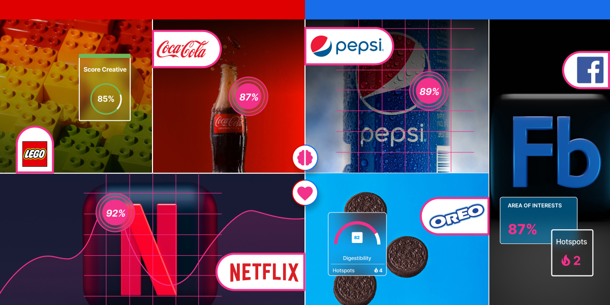
Blue is another notable color for catching the eye. Its cool, calming hue is associated with trust, dependability, and stability. It's a popular choice with brands that associate themselves with calmness and professionalism.
The color blue is also easy on the eyes and stands out against many other colors, meaning it's effective for drawing attention to specific objects or areas in a design. Whether a deep, rich navy blue or a bright, electric cobalt, blue can make a statement and capture viewers' attention.
Predictive Visual Analytics and Color
Human brains have a natural limit for the amount of visual information they can process at any moment. Subsequently, they have evolved to prioritize where to direct their attention based on low-level features of visual communication, such as color. Knowing which colors have the biggest impact influences decision-making and removes the trial-and-error aspect.
Using decades of science, the Dragonfly AI model looks at several visual cues proven to attract our first glance. This includes red and green color contrast, blue and yellow contrast, texture, orientation, scale, edges, and scale.
This innovative platform can analyze visual content and output relevant saliency heatmaps and scores, it requires human interaction to validate and interpret these outputs in the context of the objectives for the task at hand.
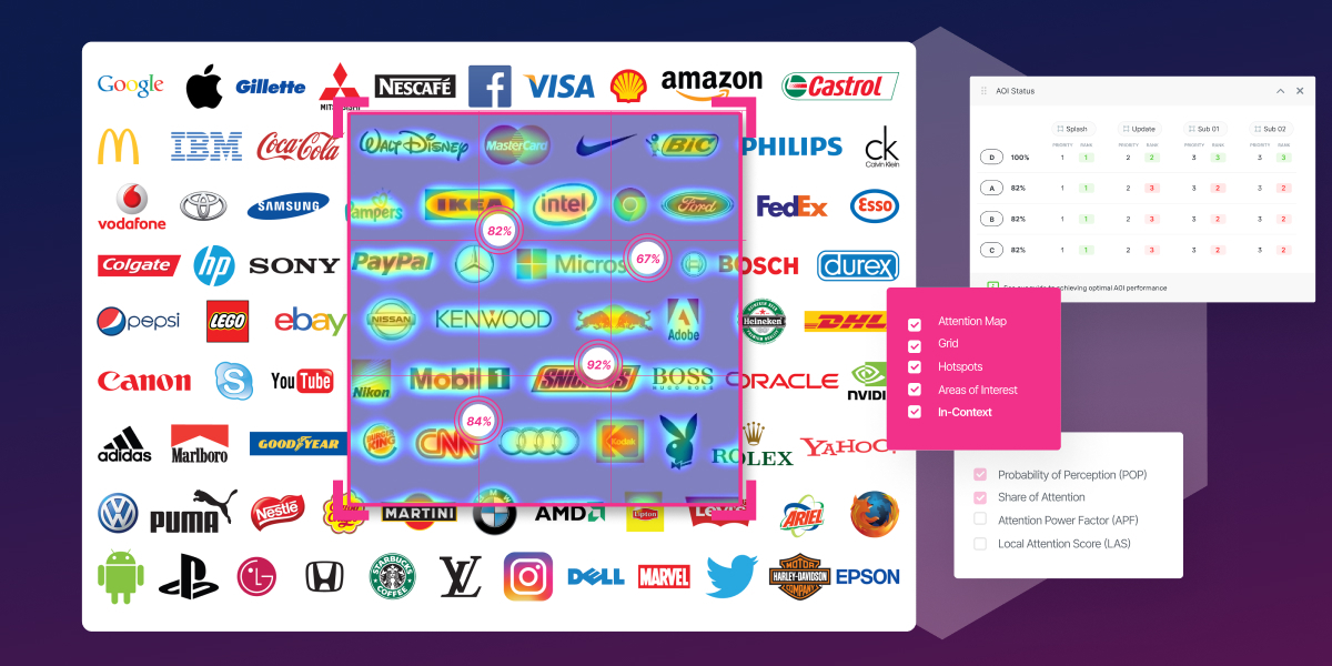
Dragonfly AI predicts the areas and elements likely to attract attention at first glance using eye-tracking technology, providing end-users with objective and unbiased metrics they can use to make data-informed decisions. For instance, it can help a brand determine the best color for a specific advert.
Boost Performance with Eye-Catching Colors
Using Dragonfly's AI model helps brands choose the colors and visual elements that attract attention in a world where it's getting harder to keep the focus. You don't need every color in the rainbow, just the ones that'll help your brand thrive in a competitive market.