.png?width=596&height=562&name=2x%20(1).png)
Many websites are losing revenue. It’s not because they lack appeal, but because they’re not strategically designed to convert visitors into customers. If you're investing heavily in driving traffic without optimizing for conversions, you're letting valuable opportunities slip away.
The importance of design in driving conversions
Your site has a few seconds to make an impression before visitors leave (and that’s being optimistic). Getting eyes on your site isn’t just about it looking slick. A conversion-focused design builds trust, communicates value, and subtly guides users towards action.
Look at Airbnb's homepage. Those stunning images of unique stays aren't there by accident. They're carefully chosen to trigger wanderlust and get you searching for your next getaway. Every element—from the prominent search bar to the "Experiences" section—is engineered to move you closer to booking.
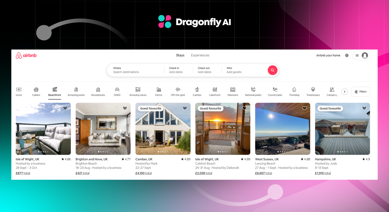
But it's not just about pretty pictures. Airbnb's design is constantly evolving based on user behavior and A/B tests. It has found that showcasing unique properties (like treehouses or houseboats) gets more engagement than generic apartment listings. It's a perfect example of how design choices directly impact user behavior and, ultimately, conversions.
Key principles of conversion-centered design
Want to turn your site into a successful conversion machine? Here's what you need to achieve:
- Clarity: Tell people exactly what you're offering and why they should care. Your value proposition should be front and center, not buried in marketing fluff.
- Focus: Your site should have one primary goal. Everything else is a distraction. If you're selling shoes, don't clutter your homepage with blog posts about sock fashion.
- Urgency: Give people a reason to act now, not later. Limited time offers, countdown timers, low stock warnings—use these sparingly, but use them.
- Consistency: Your branding should be rock-solid across all touchpoints. If your ads promise one thing but your landing page delivers another, you'll lose potential business.
- Trust: Sprinkle in some social proof. Nothing sells like other people vouching for you. Customer reviews, testimonials, trust badges are conversion gold.
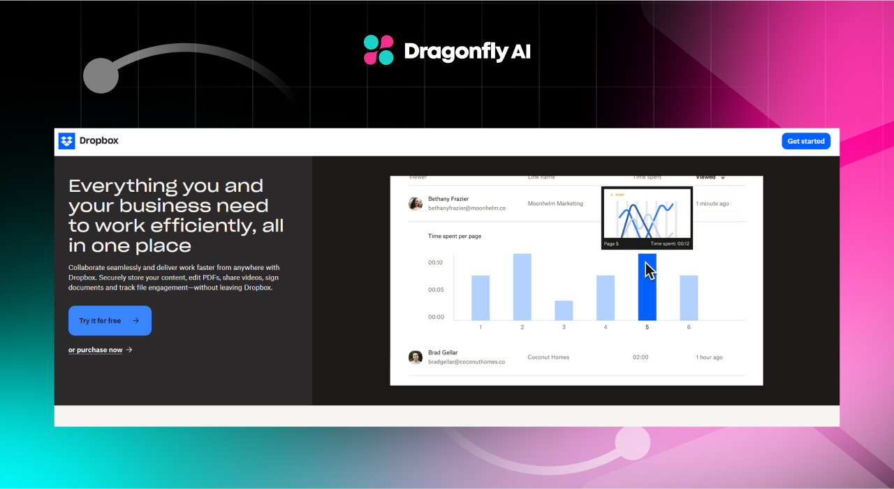
Dropbox gets this. Its homepage is laser-focused on one thing: getting you to sign up for a free account. No fluff, no distractions: just a clear value proposition and a prominent CTA. It has even simplified their pricing structure over the years, recognizing that too many options can paralyze users and hurt conversions.
Identifying conversion goals and metrics
Before you start tweaking pixels, you need to know what success looks like. Are you after email sign-ups? Product purchases? Free trial activations? Each goal needs its own set of metrics to track.
For e-commerce sites, here's what you should be obsessing over:
- Conversion rate: The percentage of visitors who complete a desired action.
- Average order value: How much are people spending per transaction?
- Cart abandonment rate: How many people are bailing at the last minute?
- Revenue per visitor: Are you squeezing the most value out of each visitor?
But don't stop there. Dig deeper into micro-conversions too:
- Email signup rate: Are people interested enough to hear more from you?
- Add-to-cart rate: Are your product pages doing their job?
- Time on site: Are people engaged with your content?
- Return visitor rate: Are you building a loyal audience?
If you're not using tools like Google Analytics, Hotjar, and Optimizely to track these, you're essentially flying blind. That’s not a place you want to be, so using what’s available should be a big priority for understanding your metrics.
User psychology and Its impact on conversions
Want to design for conversions? You need to get inside your users' heads. Here's what makes them tick:
- Social proof: People follow the herd. Show them others are buying, and they'll want in. This is why Amazon prominently displays "Customers who bought this item also bought" sections.
- Scarcity: Limited time offers work because we're hardwired to fear missing out. Ever noticed how travel sites show "Only 2 rooms left at this price"? That's scarcity in action.
- Reciprocity: Give something valuable for free, and people will feel obligated to return the favor. This is why content marketing and lead magnets are so effective.
- Cognitive ease: The easier something is to understand and do, the more likely people are to do it. This is why one-click ordering and guest checkout options boost conversions.
Amazon's product pages are a masterclass in applying these principles. Reviews? Check. Limited stock warnings? You bet. One-click ordering? It's like they're reading our minds.
But it's not just e-commerce. SaaS companies like Slack use these principles too. Its free tier gives users a taste of the product (reciprocity), while its "X% of Fortune 100 companies use Slack" messaging taps into social proof.
Using Visual Hierarchy to Guide User Attention
Your design needs to lead users by the hand to your conversion points. Here's how:
- Size matters: Make important elements bigger. It's not rocket science. Your main CTA should be the biggest button on the page.
- Color contrast: Your CTA should pop like it's coming out of the screen. Use a color that stands out from your site's main palette.
- Whitespace: Give your design room to breathe. Cluttered pages are conversion killers. Apple's product pages are a great example of effective use of whitespace.
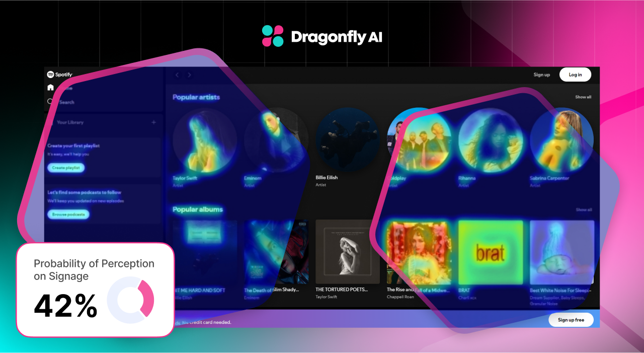
- Directional cues: Use arrows, lines, or even human gazes to point users where you want them to go. Studies show that people will follow the gaze of faces in images.
Spotify's homepage nails this. The "Sign up for free" button is practically begging to be clicked. And notice how the artist images are angled towards the CTA? That's subtle directional cueing at work.
A/B Testing and Iterative Design for Conversion Optimization
If you're not A/B testing, you're just guessing. Here's how to do it right:
Form a hypothesis. ("I bet a red CTA button will outperform our current blue one."). Then create two versions, changing only one element. After that, split your traffic between the two, and let the data decide which one's the winner. Rinse and repeat until your conversions are through the roof.
But be smart about it. Don't test tiny changes like button colors until you've nailed the big stuff. Start with your value proposition, headline, and overall layout. These will have a much bigger impact on conversions.
HubSpot's grown into the behemoth it is today largely thanks to its relentless A/B testing. It tests everything from headline copy to form field placement, and it shows in better conversion rates that help drive the company forward.
Using Data to Optimize for Conversions
Data should be driving every design decision you make. Here's how to use it effectively:
Look beyond just numbers
User feedback is gold. Use surveys, user testing, and customer interviews to understand the "why" behind the "what." Quantitative data tells you what's happening, but qualitative feedback tells you why it's happening.
For example, your analytics might show a high bounce rate on a product page, but only user interviews can reveal that it's because your sizing chart is confusing. Don't just rely on averages either. Dig into the outliers. Sometimes your biggest insights come from understanding why a small group of users behave differently from the rest.
Heatmaps
Use heatmaps and session recordings to see how people actually use your site. You might be surprised at what elements users ignore or where they get stuck. Heatmaps can reveal if users are missing important information "below the fold" or if they're getting distracted by non-clickable elements.
Session recordings are particularly valuable for identifying user frustration points, like when they repeatedly click on an element that isn't actually clickable. Pay special attention to how users navigate between pages. Are they following the path you expected, or are they creating their own roundabout journeys?
Segment your data
What works for one user group might bomb for another. A/B test different designs for different audience segments. Your mobile users might prefer a radically different layout than your desktop users. New visitors might respond better to educational content, while returning visitors want to get straight to the point.
Don't forget to segment by traffic source too—someone coming from a paid ad might have different expectations than someone coming from organic search. The key is to avoid one-size-fits-all solutions and instead tailor your design to different user needs and contexts.
Create a culture of constant optimization
The work is never done. Set up a regular cadence for reviewing data and implementing changes. Making tweaks here and there will have an impact in the longer term, and you’ll likely see better results with an “always improving” mindset.
Remember Spotify's "Wrapped" campaign? That's data-driven design at its finest. It took boring user data and turned it into a viral marketing phenomenon. But it wasn't a one-off. It’s constantly analyzing user behavior to optimize the app's UI for maximum engagement.
Designing for conversions isn't a set-it-and-forget-it deal. It's a constant process of testing, learning, and improving. But get it right, and you'll have a site that doesn't just look good - it prints money.
The Future of Conversion Design
As we look ahead, several trends are shaping the future of conversion-centered design:
- AI and machine learning: Expect to see more personalized experiences driven by AI. Think product recommendations that get spookily accurate.
- Voice UI: With the rise of smart speakers, optimizing for voice search and commands will become crucial.
- Augmented reality: For e-commerce, AR try-ons could significantly boost conversion rates. Imagine virtually trying on clothes or seeing how furniture looks in your room.
- Progressive web apps: Bridging the gap between web and mobile apps, PWAs offer app-like experiences with the reach of the web.
- Micro-interactions: Small, satisfying interactions (like the way a button animates when clicked) can significantly impact user engagement and conversions.
The key is to stay adaptable. What works today might not work tomorrow. Keep testing, keep learning, and never stop optimizing. Your conversions (and your bottom line) will very likely see the benefits as a result.
Increase your conversions with a website optimized for attention here.